
5 Pink Tones That Look Sophisticated Instead of Juvenile
InStyle recently ranked candy pink as the fifth of just six defining colour trends set to shape 2026, noting that it only works when it's treated as a grown-up alternative to sugary shades rather than a throwback to nursery walls. That's exactly the challenge we hear about most from customers walking through our door on North Street: they love pink, but they're worried it will read as childish. Below, we've pulled together 5 pink tones that look sophisticated instead of juvenile, straight from our own shelves. Check out our full pink range of wallpaper here.
Key Takeaways
- Muted beats bright. Blush, rose gold, and dusty pink read as sophisticated, while bubblegum and hot pink tend to feel juvenile.
- Metallics help. Pairing pink with silver or rose gold accents (like our Riva range) instantly grounds the colour in a more adult palette.
- Texture matters as much as tone. A panelled or acoustic finish in blush pink feels far more considered than a flat, glossy pink.
- Stripes and simple florals age well. Classic patterns in pink and white or cream and pink avoid looking like a themed nursery.
- Where you use it counts. A sophisticated pink tone works beautifully in a bedroom, hallway, or feature wall when balanced with neutral furnishings.
- Browse before you commit. Our full pink wallpaper collection is a good place to compare tones side by side.
- Ask for advice. Our team at Nobletts of North Street is always happy to talk through which pink tone suits your room and your lighting.
Why Pink Wallpaper Doesn't Have to Look Juvenile
Pink has a bit of a reputation problem. Say the word "pink wallpaper" to some customers and they picture a little girl's bedroom, all bubblegum and glitter.
We understand why. Bright, saturated pinks with a high shine finish do tend to skew younger, and there's nothing wrong with that if that's the room you're decorating.
But there's a whole other category of pink that behaves more like a neutral than a statement colour. Muted blush, dusty rose, and pink paired with metallics or cream all sit comfortably in a grown-up living room, hallway, or main bedroom.
The trick is knowing which pink tones fall into which camp, and that's what we're here to walk you through.
The 5 Pink Tones That Look Sophisticated Instead of Juvenile
We've picked five wallpapers from our own range that prove pink can be as grown-up as grey, taupe, or navy. Here's a quick overview before we go through each one in detail.
| Pink Tone | Style | Best For |
|---|---|---|
| Riva Pink/Silver | Metallic blush with silver geometric pattern | Living rooms, hallways |
| Riva Silver/Pink Blush | Cooler metallic pink-blush blend | Modern bedrooms, dressing rooms |
| Liquid Marble Rose Gold/Blush | Marble-effect with rose gold veining | Feature walls, bathrooms |
| Acoustic Panel Blush | Textured panel-effect in muted blush | Bedrooms, snugs |
| Pink and White Stripe | Classic soft stripe | Nurseries that will grow up, hallways, kitchens |
Pink Tone #1: Riva Pink/Silver for a Sophisticated Metallic Blush
Riva Pink/Silver is one of the first wallpapers we point customers towards when they say they want pink but not "girly" pink. The blush base is soft and warm, and the metallic silver pattern running through it stops the colour from feeling sweet.
We find this one works particularly well in living rooms and hallways where you want a bit of shimmer without going full glamour. Paired with grey or charcoal furnishings, it looks genuinely elegant rather than themed.
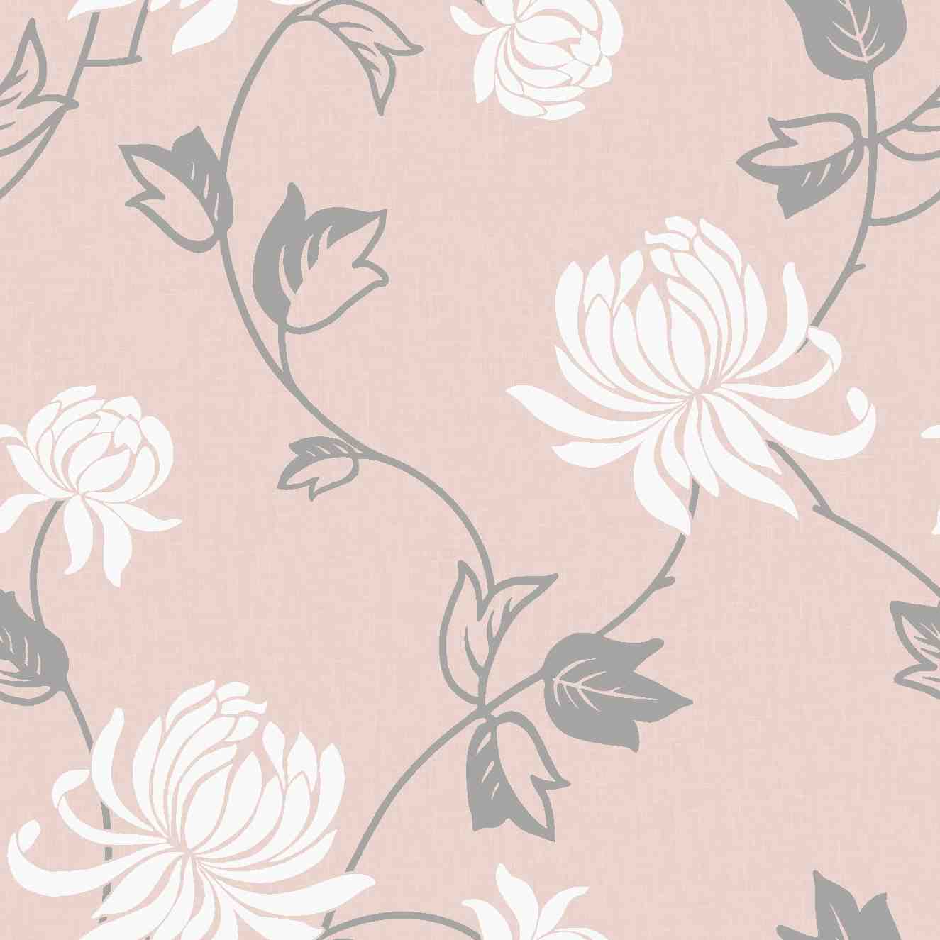
Pink Tone #2: Riva Silver/Pink Blush for a Cooler, Modern Finish
The sister design to the one above, Riva Silver/Pink Blush leans slightly cooler and greyer, which makes it read as even more contemporary. It's still unmistakably pink, but the balance shifts toward silver.
This is the pink tone we'd suggest for anyone nervous about committing to a warmer blush. It sits closer to a neutral, so it plays well with black, white, and natural wood tones.
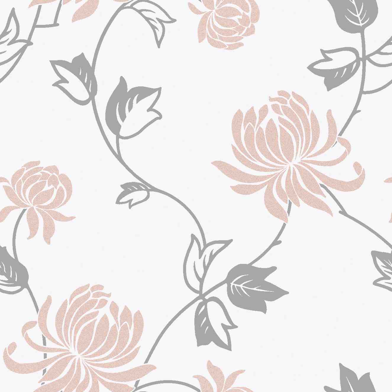
Pink Tone #3: Liquid Marble Rose Gold/Blush for Grown-Up Glamour
Marble-effect wallpaper has stayed popular for years now, and the rose gold and blush version brings that same polished look with a warmer, pinker undertone. The veining across the surface catches the light without ever tipping into anything shiny or cheap-looking.
We often recommend this one for a bathroom feature wall or an alcove behind a bed. It has the same visual weight as a stone or marble tile, just softer.
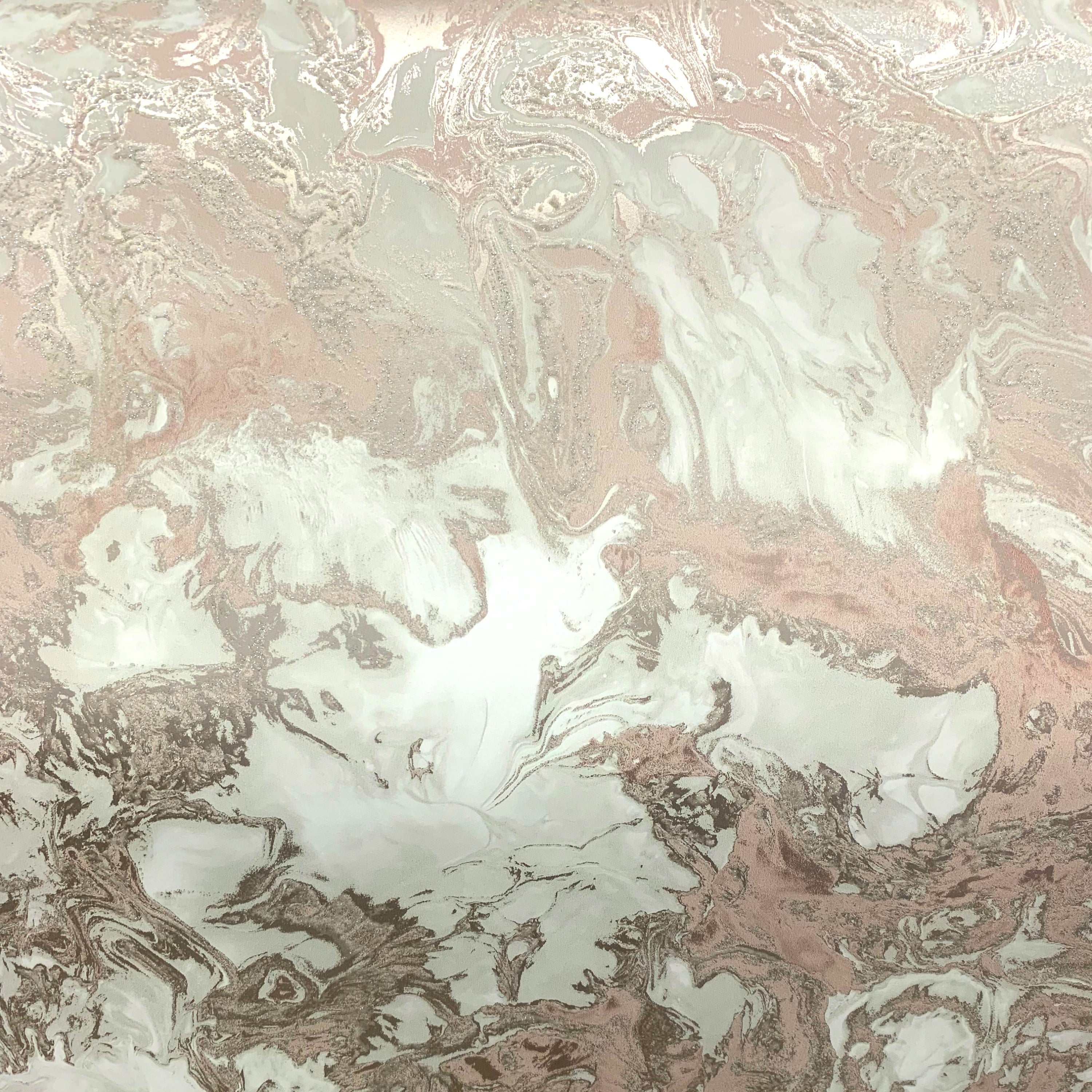
Pink Tone #4: Acoustic Panel Blush for Understated Texture
This is probably the most "adult" pink in our range. The design mimics wall panelling in a muted, dusty blush, so from a distance it can even be mistaken for a painted wall rather than wallpaper.
Texture does a lot of the work here. Because the pink is so soft and the finish is so tactile, it feels closer to a designer paint colour than a pattern, which is exactly why it doesn't read as juvenile in the slightest.

Pink Tone #5: Pink and White Stripe for Timeless, Understated Pink Wallpaper
Stripes are one of the safest patterns in decorating, and pink stripes are no exception. Our Pink and White Stripe wallpaper from Rasch Wallcoverings pairs a warm, soft pink with off-white in a classic.
It's an easy one to recommend because it works in more rooms than people expect. Yes, it suits a nursery, but it looks just as at home in a kitchen, hallway, or reading nook once the room grows past its nursery years.

Honourable Mention: Rosalie Floral Cream & Pink for a Softer Alternative
If none of the five above feel quite right, our Rosalie Floral Cream & Pink wallpaper is worth a look too. It combines a cream base with a refined floral pattern in pink, which keeps the overall look closer to a traditional, tasteful print than anything playful.
We've seen styles come and go over the decades, but a well-chosen pink has never gone out of fashion in this shop, it's just the shade of pink that changes.
How to Use These Sophisticated Pink Tones Around Your Home
Choosing the right pink tone is only half the job. How you use it in the room matters just as much.
- Balance with neutrals. Pair any of these pink tones with grey, taupe, or cream from our neutral and cream collection to keep the overall look calm.
- Feature one wall, not four. A single accent wall in a metallic pink like Riva keeps the colour from overwhelming the room.
- Think about the room's job. Softer, matte blush tones suit a living room you'll spend evenings in, while a striped pink can brighten up a kitchen or breakfast nook.
- Mind your lighting. Pink shifts warmer or cooler depending on natural light, so it's worth checking a sample against your own walls before committing to a full roll.
Plenty of customers have shared how they've used pink around the house on our own guide to using pink wallpaper, from feature walls to painted skirting to match.
Why Pink Is Having a Grown-Up Moment in 2026
This isn't just a Belfast trend. Colour forecasters have been talking about a more sophisticated pink for a while now, and 2026 seems to be the year it's really landing in home decor as well as fashion.
What's changed is the finish. The bright, almost neon pink that followed the Barbie movie's release has settled into something quieter: matte, dusty, and paired with metals like silver and rose gold rather than left to stand alone.
Muted, grown-up blush tones are commanding massive attention over bubblegum shades
We've watched this shift happen from behind our own counter for years. When a colour or pattern comes back into fashion, it rarely comes back looking exactly the same as before, and pink is a good example of that.
Visit Nobletts of North Street for Advice on Sophisticated Pink Tones
We're a third-generation family business, and we've been helping people pick wallpaper since 1939, long before "blush" or "dusty rose" were even words anyone used to describe pink. Our extensive range of wallpaper and paint is curated with both traditional tastes and modern trends in mind, so whether you want something quietly grown-up or something a bit bolder, we'll have an option for you.
We pride ourselves on providing a personal service that you just can't find in the big-box DIY stores. Visit us in-store to see the textures and colours for yourself, or browse our collections online from the comfort of your own home, and if you're still unsure which pink tone will suit your room, just ask. The Noblett family and our dedicated team are always on hand to offer expert advice on all things decorating.
Conclusion
Pink doesn't have to be a colour you outgrow. Once you know which shades to look for, it's easy to find 5 pink tones that look sophisticated instead of juvenile, whether that's a metallic Riva design, a marble-effect rose gold, a textured blush panel, or a simple pink and white stripe. We believe that your walls should tell a story, and we're here to help you find the perfect backdrop for your life, pink included.
Frequently Asked Questions
What is the most sophisticated shade of pink for wallpaper in 2026?
Muted, dusty blush tones paired with metallic accents like silver or rose gold are considered the most sophisticated pink shades for 2026. These read as grown-up because they behave more like a soft neutral than a bright, saturated colour.
How do I stop pink wallpaper from looking too girly?
Choose a matte or textured finish rather than a glossy one, and pair the pink with neutral furnishings like grey, taupe, or cream. Metallic details, marble effects, and simple stripes also help a pink tone look sophisticated instead of juvenile.
Is pink wallpaper still fashionable in 2026?
Yes, pink wallpaper is very much still fashionable in 2026, but the shade has evolved. Industry forecasters have candy pink ranked among the top color trends for the year, provided it's used as a refined accent rather than an overwhelming, saturated statement.
What rooms work best for sophisticated pink wallpaper?
Living rooms, main bedrooms, and hallways all suit a muted pink tone particularly well. Bolder pink stripes or florals can also work nicely in kitchens and dining spaces when balanced against plain white or cream woodwork.
Can pink wallpaper work with metallic or marble finishes?
Absolutely, pink paired with silver, rose gold, or marble-effect detailing is one of the easiest ways to make the colour feel current and grown-up. Our Riva and Liquid Marble ranges are good examples of pink tones that lean sophisticated rather than sweet.
What's the difference between blush pink and juvenile pink?
Blush pink is typically softer, greyer, and more muted, while juvenile pink tends to be bright, warm, and saturated, closer to bubblegum or candy floss. Blush and dusty rose tones read as sophisticated because they sit closer to a neutral on the colour wheel.
Is it worth using pink wallpaper instead of paint in 2026?
Wallpaper often gives a more sophisticated result than flat paint because it can add texture, pattern, or metallic shimmer that paint alone can't achieve. For anyone chasing one of the 5 pink tones that look sophisticated instead of juvenile, a textured or metallic wallpaper is usually the quickest way to get there.
