If you’re looking to give your home a personality that’s equal parts romance, artistry, and botanical wonder, our Florentine, Painted Landscape & Petal Rasch Wallpaper Collection is made just for you. Let’s walk through what makes this trio so special—and how it can elevate your rooms from ordinary to utterly remarkable.

🌿 What Makes This Collection Shine
-
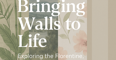
Florentine – Think lush greenery, tropical palms, towering bamboo, and oversized blooms like peonies. These designs are rendered on luxe woven-effect textures that feel indulgent under your fingertips. Soft gradients, gentle block stripes, and a pastel-toned palette keep it serene yet bold.

-
Painted Landscape – Imagine looking at a hand-brushed canvas each time you enter a room. Calm, expressive vistas in ink-blue, mossy green, pale grey, and soothing neutrals. Ideal for feature walls, bedrooms, or wherever you want a calming escape.

-
Petal – Romantic without cliché. Delicate stems and petals, watercolour washes, all set against gently textured white or cream bases. Perfect for those who love floral design but want something airy, soft, and textural.

🖼 Styling Ideas & Where It Works Best
-
Use Florentine wallpapers as a feature wall in living or dining rooms to make a statement, then echo the colours in cushions, throws, or accessories for cohesion.

-
In a bedroom or study, layering Painted Landscape wallpapers with soft lighting and natural materials (wood, linen) creates a retreat-like ambience.

-
The Petal designs are brilliant in smaller spaces—think powder rooms, behind shelving, or in a child’s room—where florals can bring light, freshness, and a romantic touch without overwhelming.

🎨 Colour Palette Highlights

You’ll see soothing neutrals, creams, greys, and soft pastels throughout the collection. Turquoise, sage, blush, moss, and ink tones pop in the Florentine & Landscape pieces; Petal ones tend to lean lighter, softer, yet lively in their contrasts. The textures—woven effects, slight surface texture, delicate embossing—add depth even when the print is subtle.
📚 Telling the Story Behind the Style
There’s a rich tradition behind designs like these. The Florentine aesthetic, for example, draws on centuries of artistry and intricate ornamentation—elements explored beautifully in articles like “What Does Florentine-Style Mean?” on Decor With Style. These aren’t just pretty patterns—they carry history, form, and emotion.
Also, if you’re curious about how florals, foliage, and texture can transform an everyday space into something really magical, the botanical-inspired room schemes in Ideal Home are a source of serious design inspiration.
💡 Practical Tips for Choosing & Using
-
Scale matters: If your room is small, go for more delicate patterns or lighter shades (Petal, some Light Florentine). In large or high-ceilinged spaces, you can carry off bold prints and darker tones from the Landscape or Florentine ranges.
-
Balance & contrast: Match busy walls with simpler furnishings; if your paper is dramatic, keep other elements (fabrics, furniture) more neutral.
-
Lighting: Natural light brings out the texture and subtle colour gradations beautifully. If the space is dim, warm lighting helps enhance depth without making tones look flat.
-
Mixing patterns: Use stripes, texture, or plain tones in trims, borders, or adjacent walls to draw focus to feature walls and avoid visual overwhelm.
🌟 Final Thoughts
Whether you’re after the grandeur of a botanical jungle, the calm of landscapes painted in mood-soothing tones, or floral romance with texture and lightness, the Florentine, Painted Landscape & Petal Rasch Wallpaper Collection has something to charm you. It’s about living with art—your walls telling stories every time you walk into a room.
Ready to transform your space? Browse the collection and imagine the possibilities.