There’s something seriously satisfying about getting that just right balance between raw, industrial texture and soft, luxurious finishes. This Instagram look is a perfect example of how industrial glam doesn’t have to feel cold or stark – it can be warm, layered and incredibly inviting.
This scheme is all about contrast. Rough meets refined. Metallic shimmer meets tactile softness. Bold pattern is grounded with calm, neutral backdrops. Let’s break it down.
The Statement Wall: Industrial Glam Silver & Gold Wallpaper
At the heart of the look is the Industrial Glam Silver & Gold Wallpaper. This design is full of character – distressed textures, layered tones and flashes of metallic gold that catch the light beautifully. It brings that raw, urban edge you’d expect from an industrial style, but the subtle metallic finish elevates it into something much more luxurious.
It works brilliantly as a feature wall, especially when paired with warm lighting and natural textures. Perfect for living rooms, bedrooms or even a dramatic hallway moment.
👉 Tip: This wallpaper really comes alive in the evening when lamps and warm bulbs highlight the gold accents.

Softening the Look with Silk Weave Opulent Gold Wallpaper
To balance the boldness of the feature wall, we paired it with Silk Weave Opulent Gold Wallpaper. This is where the scheme softens and warms up. The fine woven texture adds depth without competing, while the gold tone brings a gentle glow that ties in beautifully with the metallic notes in the feature wall.
This kind of wallpaper is ideal for creating cohesion – it calms the space while still feeling rich and considered.

Grounding the Scheme: Silvana Plain Charcoal Taupe Wallpaper
Every strong scheme needs a grounding element, and Silvana Plain Charcoal Taupe Wallpaper does exactly that. The subtle texture adds interest without shouting, and the charcoal-taupe tone sits perfectly between warm and cool.
It’s an incredibly versatile shade and works as a brilliant backdrop for both metallic finishes and animal prints – which brings us neatly on to the cushions.

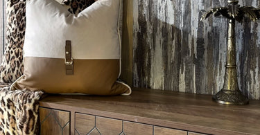
Layering with Cushions: Buckle Up & Deaf Leopard
Cushions are where you can really have fun, and this pairing is spot on.
The Paul Moneypenny Buckle Up Neutral Cushion adds structure and polish. The neutral tones keep things calm, while the leather-style detail introduces a touch of tailored luxury that fits the industrial vibe perfectly.

Paired with it is the Paul Moneypenny Deaf Leopard Cushion – bold, confident and full of personality. The animal print injects warmth and softness, stopping the scheme from feeling too serious and adding that boutique-hotel feel we all secretly want at home.

Layering these together instantly makes the space feel styled rather than staged.
Finishing Touches: Crown Paint Mixed In-House
To pull everything together, we used Crown paint mixed on our Crown Trade machine, allowing us to fine-tune the colour to sit perfectly with the wallpapers and soft furnishings. This is one of those behind-the-scenes details that makes a huge difference – getting the paint just right ensures the whole scheme flows seamlessly from wall to wall.
If you’re ever unsure about paint shades alongside wallpaper, this is where expert colour matching really earns its keep.

The Final Look
The result is a space that feels layered, confident and effortlessly stylish. It’s industrial glam with warmth – full of texture, depth and contrast, without ever feeling cold or overdone.
If you love schemes that mix bold wallpaper with tactile neutrals and statement accessories, this is a look well worth stealing.
As always, if you’d like help recreating this style at home – or putting your own spin on it – pop into the shop or get in touch. We’re always happy to help you pull everything together ✨