If you've ever stood staring at wallpaper online thinking "That looks lovely... but will it actually work in my room?", you are definitely not alone. When it comes to Paul Moneypenny vs Standard Designs: the difference in tactile depth is the kind of thing you can feel the moment you walk into a room, and it's exactly why textured pieces have been shown to attract 40% higher resale inquiries compared to flat, mass-produced alternatives.
Here at Nobletts, we've been transforming houses into homes since 1939, and if there's one thing our fourth-generation family business has learned, it's that texture matters. Whether you're freshening things up or doing a full room overhaul, understanding tactile depth is the secret to choosing wallpaper that actually has soul.
Key Takeaways
| Question | Quick Answer |
|---|---|
| What is tactile depth in wallpaper? | The physical texture and raised elements you can actually feel, not just see. Paul Moneypenny designs use layered materials to create depth standard flat wallpapers simply don't have. |
| Is Paul Moneypenny wallpaper worth it? | If you want a room that feels curated and full of character, yes. The tactile quality makes walls feel alive rather than flat. |
| Can I use textured wallpaper in a bedroom? | Absolutely. Wallpaper in bedroom design benefits hugely from tactile depth because it adds warmth and coziness without needing extra accessories. |
| How does Paul Moneypenny compare to designer wallpaper brands? | The Moneypenny collection holds its own against brands like Sanderson wallpapers and Graham and Brown wallpaper, particularly in terms of physical texture and warmth. |
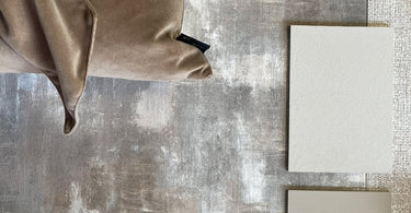
| Where can I see Paul Moneypenny designs in person? | Visit our Belfast City Centre store! You can also browse the full Paul Moneypenny collection online. |
| Does tactile depth affect room lighting? | Yes! Textured wallpapers catch light differently throughout the day, creating shadows and highlights that change the mood of your space from morning to night. |
Why Paul Moneypenny vs Standard Designs: The Difference in Tactile Depth Matters in 2026
Some wallpapers quietly arrive on our shelves. Others create a frenzy.
Paul Moneypenny's collection falls firmly into the second category, and it's not hard to see why. As our Store Manager (and yes, the same Paul Moneypenny linked to BBC Design Masters), Paul brings a designer's eye to every single roll. He understands that a wall isn't just a surface to cover. It's a feeling.
Standard designs, the kind you find in every DIY shed and discount bin, are flat. Not just physically flat, but emotionally flat. I can imagine people calling them "Landlord Special": bland, safe, uninspiring. That's not a compliment.
When we talk about Paul Moneypenny vs Standard Designs: the difference in tactile depth comes down to one simple thing. Can you feel it? Not metaphorically. Can you actually run your hand across the wall and feel something real?
With Paul's designs, the answer is always yes. From the Urban Texture Grey range to his bold leopard print wallpapers, every design has a physical presence that standard wallpapers simply cannot replicate.
What Is Tactile Depth in Wallpaper?
Tactile depth is the physical dimension of a wallpaper's surface. Think raised patterns, layered textures, embossed details, and materials you can actually feel under your fingertips.
Standard wallpapers? They're printed on flat paper and that's that. You look at them, and they look fine from across the room. But get close and there's nothing there. No surprise, no delight, no sense that someone actually thought about how the wall would feel.
Paul Moneypenny's designs are different. They use techniques like foil layering, raised inks, and textured substrates to build actual physical depth into the wallpaper. When light hits a Paul Moneypenny wall, it doesn't just bounce back evenly. It catches on ridges, creates soft shadows in grooves, and changes character as the sun moves through the day.
That's what we mean by tactile depth. It's the difference between a wall that exists and a wall that lives.

Paul Moneypenny vs Standard Designs: The Difference in Tactile Depth Explained
Let's break this down properly. When we compare Paul Moneypenny vs Standard Designs: the difference in tactile depth shows up in several specific, measurable ways.
1. Surface Texture
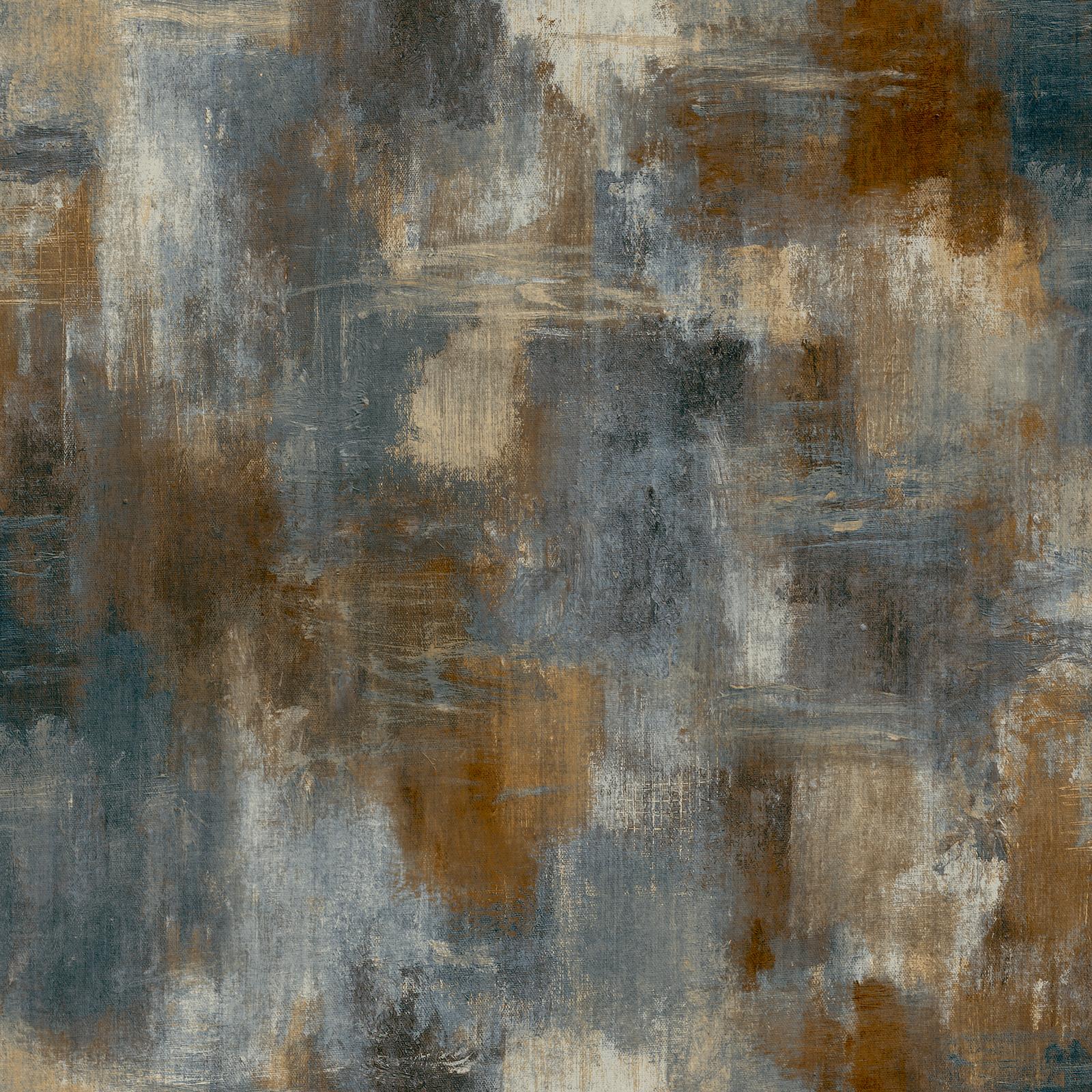
Standard wallpapers use a single layer of printed ink on flat paper. Paul Moneypenny designs use multi-layered printing techniques that build genuine texture into the surface. Run your hand over the Abstract Texture Blue Wallpaper and you'll feel exactly what we mean.
2. Light Interaction
Flat wallpapers absorb and reflect light uniformly. Textured wallpapers create dynamic light play, with shadows and highlights shifting throughout the day. This is particularly stunning in Urban Texture Grey, where the tactile surface creates almost a plaster-like effect.
3. Durability of the Texture
Cheap textured wallpapers lose their tactile quality after a few years. Paul's collection uses quality materials designed to hold their depth for the long haul. (That's the kind of practical reality check we always like to give you!)
4. Emotional Impact
This one is harder to measure but impossible to ignore. A room with tactile depth feels warm, considered, and full of life. A room with flat wallpaper feels like a showroom waiting for styling, not a home that's already full of life.
The Urban Texture Collection: Tactile Depth in Action
If you want to see the Paul Moneypenny vs Standard Designs: the difference in tactile depth debate settled in a single product, look at the Urban Texture range.
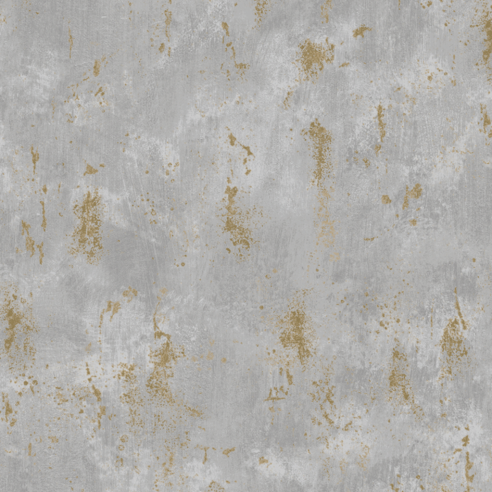
The Urban Texture Grey (175205) is a masterclass in tactile design. It mimics the look and feel of raw plasterwork, giving your walls a depth that looks almost architectural. This isn't wallpaper pretending to be something else. It's wallpaper that has its own honest, textured identity.
Then there's the Urban Texture Cream and Taupe variant (175208), which adds subtle gold flecks into the tactile surface. The gold catches light at different angles, meaning your wall actually changes appearance depending on the time of day. Standard wallpaper cannot do this. Full stop.
And for something with even more drama, the Castello Plaster range (available in both Grey and Navy) takes tactile depth to another level entirely. These designs have a heavily embossed surface that creates genuine shadow play. It's the kind of wallpaper that makes guests reach out and touch the wall.
Comparing Tactile Depth Across Popular Wallpaper Styles
Let's be real for a moment. The wallpaper world in 2026 is absolutely packed with options. From William Morris wallpaper to Graham and Brown wallpaper, from Sanderson wallpapers to funky wallpaper from The Range, you have more choice than ever before.
But here's the thing. Not all textured wallpaper is created equal.
William Morris wallpaper has beautiful flat-printed botanical designs, but traditionally lacks heavy tactile depth. The patterns are stunning, yes, but the surface remains smooth. It's a different kind of beauty.
Graham and Brown wallpaper offers some textured options, particularly in their paintable ranges. These are decent if you want a subtle texture, but they don't have the layered, designed depth of Paul Moneypenny's collection.
Sanderson wallpapers are gorgeous and heritage-rich, but again, many of their most popular designs are flat-printed. Beautiful to look at, less interesting to touch.
Where Paul Moneypenny stands apart is in making tactile depth the star of the show. His animal print wallpapers, including the stunning Leopard Chocolate Gold, use foil and texture layers that make the pattern physically pop off the wall. That's designer wallpaper that actually delivers on the "designer" promise.
And if you're looking at black and gold wallpaper or wallpaper in black and white, Paul's collections offer versions with genuine tactile depth that you simply won't find in flat-printed alternatives from budget retailers.

How Tactile Depth Changes Your Room
Here's where it gets really interesting. Tactile depth doesn't just change how your walls look. It changes how your room feels.
In a living room, textured wallpaper adds a layer of warmth that flat walls can't achieve. The Floral Hall Green design, for example, uses tactile detailing to make the sage green feel fresh and calming while keeping the overall look light and airy. (Yes, you can have texture AND lightness in the same room!)
For wallpaper in bedroom design, tactile depth is a game changer. A textured wall behind your bed creates an instant focal point that feels cosy and intimate. Cream wallpaper with subtle texture works beautifully here, as does the softer Abstract Texture Blue for a more contemporary feel.
And if you're going bold with leopard print wallpaper or black and gold wallpaper in a living space, the tactile quality stops the pattern from feeling flat or garish. The texture gives it richness and sophistication.
Things that make a house feel like a home, not a catalogue. That's what tactile depth does.
How tactile depth in Paul Moneypenny designs drives measurable buyer and property benefits.
Paul Moneypenny vs Standard Designs: The Difference in Tactile Depth for Your Budget
Let's address the elephant in the room. Price.
Yes, Paul Moneypenny wallpaper costs more than standard designs you might find at a discount retailer. But here's the question you should really be asking: what are you actually getting for that extra money?
With standard wallpaper, you're paying for a printed sheet of paper. With Paul Moneypenny designs, you're paying for:
- Multi-layered printing techniques that build physical texture into the surface
- Quality substrates that hold their tactile depth for years, not months
- Designer-led patterns that have real thought and expertise behind them (Paul's BBC Design Masters background is not just a nice bio, it shows in the work)
- Foil and metallic accents that catch light and add genuine depth
- A wall that feels considered, personal, and full of character
When you break it down like that, the value proposition becomes pretty clear.
If you're working with a tighter budget, consider using Paul Moneypenny wallpaper on a single feature wall. A textured accent wall in wallpaper for living rooms or as a bed wallpaper backdrop gives you maximum impact for a fraction of the cost of papering the whole room.
You can explore the Spring Collection or check out Paul and Michele's Spring Madness for some great value options that still deliver on tactile depth.

Choosing the Right Tactile Depth for Your Space
Not every room needs maximum texture. Here's our practical guide to matching tactile depth to your space.
Living Rooms: Go bold. This is where you entertain, where people gather. A heavily textured wallpaper like the Castello Plaster range or the Leopard Wallpaper creates instant drama and conversation.
Bedrooms: Medium texture works best here. You want warmth without overwhelming. The Abstract Texture Blue or a softer cream wallpaper with subtle tactile details will make your bedroom feel like a retreat.
Hallways: Surprisingly, this is a great place for tactile depth. Hallways are often overlooked, and a textured wallpaper adds unexpected delight. The Urban Texture Grey is perfect because its plaster-like finish handles high-traffic areas beautifully.
Dining Rooms: If you're going for art deco style wallpaper or black and gold wallpaper, dining rooms are the place. The tactile depth from Paul's foil-layered designs catches candlelight beautifully.
Home Offices: Silver wallpaper or stripe wallpaper with subtle texture works wonderfully here. Enough interest to feel considered, not so much that it distracts.

What About Other Popular Wallpaper Trends?
We get asked about specific styles all the time. Let's address some of the most popular searches and how they relate to tactile depth.
Floral wallpaper is having a massive moment in 2026. Paul Moneypenny's take on florals includes tactile details that make petals and leaves feel almost three-dimensional. Compared to flat William Morris wallpaper, the difference is striking. (And we love William Morris! But there's room for both in the world.)
Purple wallpaper and brown wallpapers benefit enormously from texture. Flat purple can feel flat-out dull, but add tactile depth and suddenly you have richness and warmth. The same goes for brown, which can either feel chocolatey and luxurious (textured) or just muddy (flat).
Tree wallpaper and nature-inspired designs are naturals for tactile treatment. The bark, leaves, and branches lend themselves to raised printing and embossed details that make the design literally come alive on your wall.
White with black wallpaper and wallpaper in black and white might seem like they wouldn't need texture, but the opposite is true. Monochrome designs rely on contrast, and tactile depth adds a whole new dimension of contrast beyond just colour. The shadows created by texture give monochrome designs a sophistication that flat versions simply cannot match.
Our Heritage, Your Home
Our story began in 1939 when Richard Noblett, a sales representative for Crown Wallcoverings, was sent from Darwen, Lancashire to Belfast to temporarily fill in for a colleague. He never went back.
Four generations later, we're still here in Belfast City Centre, still helping you find wallpaper that actually means something. We don't stock anything we wouldn't hang in our own homes, and we're proud of that.
When Paul Moneypenny designs his collections, he brings that same philosophy. Every texture, every layer, every tactile detail is there for a reason. Not to tick a trend box, but to make your walls feel alive.
At Nobletts, we believe that every space deserves a touch of personal flair and sophistication. Paul's collection delivers exactly that, with the kind of tactile depth that standard designs can only dream about.
Conclusion
So, Paul Moneypenny vs Standard Designs: the difference in tactile depth comes down to this. Standard designs give you a picture on a wall. Paul Moneypenny gives you an experience.
The texture you can feel, the light that shifts throughout the day, the warmth that makes a room feel genuinely lived in. These aren't small differences. They're the difference between a house and a home.
Whether you're transforming a tired space or just freshening things up, it's not just about picking a colour. It's about choosing the right product. And when it comes to tactile depth, Paul Moneypenny's collection stands in a league of its own.
Come visit us in our Belfast City Centre store and run your hand along the samples. (We genuinely love watching people's faces when they feel the difference for the first time!) Or browse the full Paul Moneypenny collection online and start planning your tactile transformation today.
Frequently Asked Questions
Is Paul Moneypenny wallpaper worth the investment in 2026?
Absolutely. When comparing Paul Moneypenny vs Standard Designs: the difference in tactile depth is immediately noticeable in person. The multi-layered textures, foil accents, and quality materials create a wall that genuinely feels different to the touch, making it worth every penny for homeowners who want character and warmth.
Can I use Paul Moneypenny textured wallpaper in a bedroom?
Yes! Wallpaper in bedroom design benefits hugely from tactile depth because it adds coziness and warmth. The Abstract Texture Blue or softer cream wallpaper options from the collection create a restful, tactile backdrop that makes your bedroom feel like a proper retreat.
How does Paul Moneypenny compare to Graham and Brown or Sanderson wallpapers?
While Graham and Brown wallpaper and Sanderson wallpapers both offer beautiful designs, Paul Moneypenny's collection focuses specifically on tactile depth as a core feature. The multi-layered printing and foil techniques create physical texture that many heritage brands' flat-printed designs simply don't have.
What is the most tactile Paul Moneypenny wallpaper design?
The Castello Plaster range (available in Grey and Navy) offers the most pronounced tactile depth, with a heavily embossed surface that mimics real plasterwork. The Urban Texture Grey is another standout, creating architectural depth that catches light beautifully throughout the day.
Can textured wallpaper work in a small room?
Yes, with the right approach! Use a textured wallpaper on a single feature wall rather than all four walls. Lighter colours like cream wallpaper or silver wallpaper with subtle texture will add depth without making a small space feel closed in. The tactile quality actually draws the eye and creates interest without needing bold patterns.
Does Paul Moneypenny wallpaper come in black and gold designs?
Yes! The Leopard Chocolate Gold wallpaper is a stunning example of black and gold wallpaper with genuine tactile depth. The foil accents catch light differently throughout the day, giving the design a richness that flat-printed black and gold alternatives simply cannot achieve.
Where can I see and feel Paul Moneypenny wallpaper in person?
Visit our Belfast City Centre store! We've been a Belfast Institution since 1939, and we'd love to show you the Paul Moneypenny collection in person. Feeling the tactile depth for yourself is really the only way to fully understand the difference between these designs and standard flat wallpapers.