There’s something about spring that makes you want to throw the windows open, let the light flood in and give your home a little reset.
After months of cosy layers, darker tones and winter textures, this is the season for softness, freshness and a hint of joy. And the best part? You don’t need to completely redecorate to feel that shift. A few thoughtful updates can transform a room.
We recently created these spring mood boards to capture that feeling of renewal – and they’re the perfect inspiration if you’re thinking about refreshing your interiors.
1. Bring the Outside In with Watercolour Florals
Nothing says spring quite like florals – but this season it’s all about softer, painterly designs.
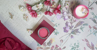
The wallpaper in our mood board features delicate blossoms in blush pinks, gentle purples, soft greens and warm neutrals. It feels almost like a watercolour painting across the wall. The beauty of this style is that it’s romantic without being overpowering. It adds interest, movement and colour, while still keeping the space light and airy.
Floral wallpaper is ideal for:
-
A bedroom feature wall
-
A fresh hallway update
-
A feminine living room
-
Even a guest room that feels welcoming and uplifting
Pair it with simple furniture and let the walls do the talking.

2. Add Depth with Rich Accent Colours
Spring doesn’t have to mean pale everything.
In our boards, we’ve introduced deep berry and raspberry tones through statement cushions and accessories. That rich red instantly lifts the softer florals and adds depth and drama. It stops the look from feeling too “sweet” and gives it a more sophisticated edge.
This is a brilliant trick if you already have neutral walls:
-
Add bold cushions
-
Introduce a statement throw
-
Bring in a strong paint accent through accessories
Even something as small as a candle or decorative tray in a punchy tone can tie a whole look together.

3. Mix Textures for a Layered Look
Spring interiors are about more than colour – texture plays a huge role.
In these mood boards, you’ll see:
-
Soft velvet-style cushions with oversized floral detailing
-
Subtle textured neutrals
-
Embroidered and raised fabrics
-
Matte painted finishes
Mixing textures keeps a room feeling warm and welcoming while still being fresh. If everything is flat and smooth, it can feel cold. But when you layer soft fabrics against lightly textured wallpaper or paint, it creates that cosy-but-light spring balance.
4. Refresh with Paint (It’s the Easiest Win!)
If wallpaper feels like a big commitment, paint is the quickest way to reset a space.
Spring is perfect for:
-
Warm blush tones
-
Soft muted pinks
-
Gentle sage greens
-
Creamy neutrals with warmth
In our mood boards, the pink paint sample works beautifully against the floral wallpaper – it draws out the petals and creates cohesion. When choosing paint, always look at your wallpaper (or fabrics) first and pull a tone from within the design. That’s how you achieve that professionally styled feel.

5. Small Changes, Big Impact
A spring refresh doesn’t have to mean a full room makeover. Think about:
-
Swapping heavy winter cushions for lighter, brighter ones
-
Changing artwork to something floral or botanical
-
Adding fresh (or faux!) flowers
-
Updating a single feature wall
-
Introducing one bold accent colour
It’s about creating a space that feels lighter, brighter and ready for a new season.

Ready for a Spring Reset?
Spring is all about renewal – and your home deserves that same fresh start.
Whether you’re planning a full wallpaper transformation or just looking to introduce a few new cushions and a tin of paint, the key is layering colour, softness and personality in a way that feels uplifting.
If you’d like help pulling a look together, we’re always happy to chat – in-store or online. Bring your ideas, your samples, even your photos. That’s what we love doing.
Let’s make your home feel like spring 🌸
If you’re in full spring-refresh mode and fancy a bit more inspiration, have a browse through Sherwin-Williams’ Colour of the Year archive and how their palettes are built, plus Benjamin Moore’s seasonal colour palettes and their Colour Trends page for extra colour pairing ideas. And if wallpaper is calling your name, these round-ups from Homes & Gardens and House & Home are packed with great real-room inspiration.