If you’re thinking about giving your home a lift for the brighter months ahead, this is the one trend you don’t want to miss.
Spring/Summer 2026 is all about bold florals, uplifting colour, and layered textures — and we’ve just had a brand new collection land in-store that ticks every single box.
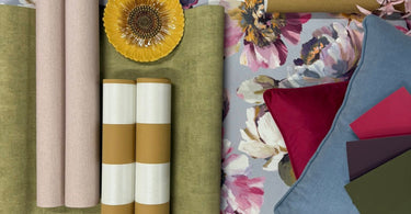
We’ve pulled together a mood board to show exactly how to style it… and honestly, it’s one of our favourites this year.
The Star of the Show: Double Width Floral Wallpaper
At the heart of this look is the stunning
👉 https://noblettswallpaper.com/products/calbria-floral-lilac-and-pink-double-width-wallpaper

This isn’t your typical floral.
It’s a painterly, oversized design that blends:
- Soft lilacs and blush pinks
- Rich purples and muted blues
- Pops of buttery yellow
Set against a gentle grey background, it feels fresh, modern, and just the right amount of bold.
Why everyone’s loving it:
- Double width = fewer seams, cleaner finish
- Works beautifully as a feature wall or full room
- Instantly brightens darker spaces
How to Style It (Without Overthinking It)
One of the biggest questions we get is: “What do I pair with a statement wallpaper like this?”
That’s exactly why we created this mood board — to show how easy it can be.

1. Ground It with Soft Green Texture 🌿
👉 Asperia Plain Green Wallpaper

This muted green adds calm and balance, stopping the florals from feeling overwhelming.
It’s perfect for:
- Adjacent walls
- Hallways flowing into the room
- Or even a full room if you want something more subtle
2. Warm It Up with Mustard Tones 💛

👉 https://noblettswallpaper.com/products/schoner-wohnen-cosy-living-mustard-yellow-wallpaper
That buttery yellow you see in the floral? This ties it all together.
It brings:
- Warmth
- Depth
- A slightly retro, sunny feel
Ideal if you want your space to feel cosy and bright.

3. Add Structure with Stripes
Stripes are back in a big way for 2026, and they’re the perfect contrast to florals.
Ochre option (warm + bold):
👉 https://noblettswallpaper.com/products/juliette-stripe-ochre-wallpaper

Sage option (soft + calming):
👉 https://noblettswallpaper.com/products/juliette-stripe-sager-wallpaper

They help:
- Break up busy patterns
- Add height or width to a room
- Create a more designed, layered look
The Look: Effortless but Pulled Together
What makes this combination work so well is the balance:
- Floral = expressive + eye-catching
- Plain textures = calm + grounding
- Stripes = structure + rhythm
Then finish it off with:
- Velvet cushions in deep pinks or blues
- Soft linens
- A few statement accessories (those ceramic pieces really pop 👀)

Why This Trend is Going Nowhere
This isn’t just a passing look.
We’re seeing more people move towards:
- Personality over plain
- Layered interiors instead of “matchy-matchy”
- Statement walls that actually feel joyful
And florals like this hit that sweet spot — bold, but still liveable.
Want to See It in Person?
Photos are great, but this one really comes to life when you see the scale and texture up close.
👉 You can shop the full look online or call into us in-store to see the collection for yourself.
If you’re not sure what works in your space, we’re always happy to help you pull a scheme together.
Final Thought
If your home’s been feeling a bit flat over winter, this is your sign.
A fresh wallpaper, a few colour updates, and suddenly everything feels new again.
And this collection? It’s a pretty great place to start 💐