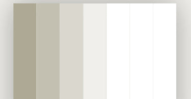
Every year, Pantone picks a “ColoUr of the Year” — a shade that’s supposed to capture the mood, the aspirations, the aesthetic of the coming 12 months. For 2026, that shade is Cloud Dancer (Pantone 11-4201). It’s being described as a “billowy white,” “a whisper of calm and peace in a noisy world.” Creative Review
But to me, Cloud Dancer isn’t really a colour — not in the way you’d usually pick a main palette or choose a bold shade to build a room around.

It feels more like a neutral backdrop than a real colour

Cloud Dancer reads as an off-white — more of a soft canvas than a hue with character. It’s the kind of shade you call upon when you don’t want much attention drawn to the walls. In practice, it behaves like a default, rather than a statement.
Hard to build a personality around
In interiors — especially as a retailer of wallpaper, paint and soft furnishings — you want colours that create mood, define atmosphere, and give personality. A strong navy, a deep terracotta, a rich forest green — these create drama, warmth, depth. Cloud Dancer just hovers in the background.
As such, it feels like a cop-out. A “safe” option for people who don’t want to risk anything. A shade for those who want minimal effort, minimal drama — but also minimal character.
Too sterile for a lived-in home
Homes should feel lived-in: cosy, messy, warm, layered with imperfections, memories, personality. Cloud Dancer feels too sterile — like a showroom waiting for styling, not a home that’s already full of life.
I understand the appeal of calm, clean, ‘quiet minimalism’. But for many, that translates into blandness. I can imagine people calling it “Landlord Special”: bland, safe, uninspiring. That’s not a compliment.
The accompanying palette choices aren’t all on point — at least for me

Pantone themselves show how Cloud Dancer might pair with “powdered pastels” and “muted” palettes. ELLE Decor+2Architectural Digest+2 But these soft, washed-out combinations don’t speak to me. I don’t find them flattering, I don’t find them vibrant — I find them dull.
I see Cloud Dancer more as what you use to frame a main shade — perhaps a bold wallpaper, a dramatic feature wall, or strong, moody accent colours. But as the hero of a room? No thanks.
It doesn’t capture life or character
For me, design — especially interiors — is about personality. It’s about telling a story, reflecting the people living there, the mood, the character. Cloud Dancer is more like a blank page. Sometimes that’s helpful. But too often, a blank page stays blank — or worse — feels empty.
Is This a Step Back Into the Grey Era?
What worries me most is that Cloud Dancer feels like the beginning of a slide back into the grey years — that long stretch where every home, rental, office and new build was coated in the same cold, muted neutrals. Just when interiors have started to embrace warmth, colour, texture and personality again, Pantone’s pick hints at a return to the washed-out, risk-free palettes so many of us were desperate to move past. It’s as if we’ve swapped grey for “almost grey” and called it progress. And honestly? It feels like a backwards step.
What It Could Work For
That said — I don’t think Cloud Dancer is useless. There are ways it might work in real homes. After all, a soft off-white that’s subtle, airy and neutral can have its place.
-
As a backdrop for strong feature walls (patterned wallpaper, bold colours, statement textures).
-
In spaces meant for calm and minimalism: maybe a modern bathroom, a minimalist kitchen, or a Scandinavian-style living room.
-
When layered with warm, natural materials — wood, woven textiles, plants — maybe the “sterility” softens into quiet elegance.
-
In small doses — ceilings, trims, built-ins, joinery — where you don’t want colour competition but want a unified base.
In short: seen as a supporting act, not the lead.
So… What Does This Say for Trends — and For Us (As a Wallpaper & Paint Retailer)
Because with our background — 4th generation, family run, with an eye for interiors — we know that colour is much more than a “colour of the year”. It’s about context, taste, lifestyle, personality.
Trends like Cloud Dancer tell one story: minimalism, calm, easy neutrality. But that story isn’t universal — and that’s fine.
What we see instead as our strength is offering something different. Stronger colours. Texture. Character. Warmth. Things that make a house feel like a home, not a catalogue.
Because there’ll always be customers who want a blank canvas. But there’ll also always be people looking for soul, warmth and personality.
And that’s where we — and you — shine.
Final Thoughts
Cloud Dancer might as well be the most “safe” Colour of the Year Pantone could pick. Maybe that’s the point: after loud, expressive hues, maybe we want calm. Maybe we want neutrality. But for me — and perhaps for many of your customers — “safe” equals uninspiring.
If we’re going to build spaces that feel like real living — warm, personal, characterful — then I’d rather reach for colours that have personality.
Cloud Dancer? Maybe as a backdrop. But never as the star of the show.